
Video game visuals through the ages
Joe Merrick
A strange sensation hit me while I was playing Virtua Racing this month; it hit me that I genuinely think the game is beautiful. You might think I’m an idiot for thinking so. After all, this is a very early 3D game, with few polygons on screen, none of which have any textures or are framed with complex lighting. It’s a pragmatic approach to 3D graphics: rendering something that just about resembles what it needs to without sweating game performance.
In this age of graphics full of photorealistic tricks like shaders and ambient occlusion, with real-time ray-tracing peeping out from behind the next digital corner, it’s easy to look at early 3D games and laugh at how simplistic they are. I’ve always believed, though, that good design is beautiful forever, whether it’s pixel art, simple 3D or something more complex. Virtua Racing’s bright colours, clean lines and absolute focus on delivering a playable 3D world make it sing.

You have to understand, I don’t have any particular attachment to the game. Up until its release on Switch I hadn’t really ever played it. But it has now joined the ranks, in my mind at least, of games that have such a unique and wonderful visual identity that they’ll always look fantastic.
These hallowed ranks of course include some great game you’ll no doubt have played and love yourselves. Okami is a prominent feature. There’s a game whose whole visual style marries perfectly with its story and its entire game design.
Replacing the Zelda-formula’s items with celestial paintbrush skills feels so much more organic and rewarding when the game itself looks like a vivid painting brought to life. Did you ever just paint the ground to make trees appear for no real reason before? Okami’s visuals are what draw you in to doing that. Its ‘hand-drawn’ world is so rich and inviting that it’s hard to resist, and harder to forget.
Of course, a lot of the techniques used in Okami’s visuals are part of the same lineage as the absolute king of cel-shading: Jet Set Radio. I’ll always remember the first time I saw those black lines, solid colours and character designs in the world of Tokyo-To. I still think that even now, decades later, Jet Set Radio and its sequel are the high benchmarks for cel-shading. They have colour, style, weight, presence and a unique identity to them that is unmatched. Think about every cookie cutter cel-shaded weeb game today and there’s just no comparison.


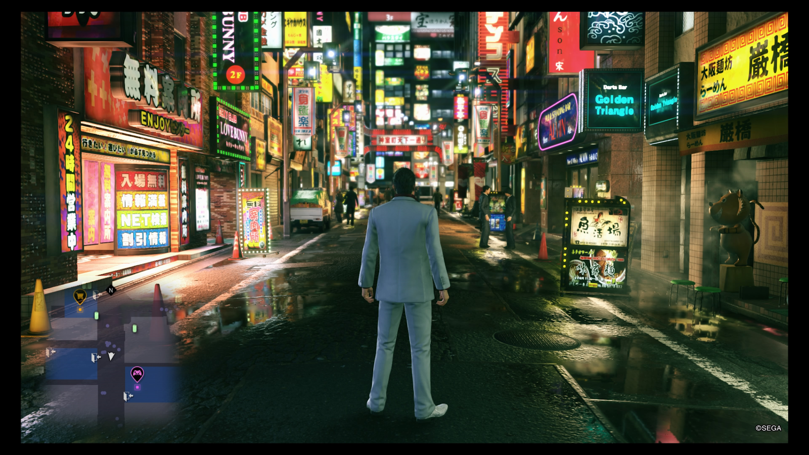
That’s not to say that every unique and memorable visual style is cartoonish or overly stylistic. This is Bit Socket, after all, so we can’t go an entire page without mentioning Yakuza. You might sigh and roll your eyes, but have you seen the Dragon Engine?
For years, the Yakuza games have always been sort of shrugged at and written off as being permanently a generation behind, but the Dragon Engine used in all games from Yakuza 6 onwards just looks incredible.
It’s the perfect blend of photorealism and unique, swaggering style.
The physics-based lighting looks wonderful, but it never looks generic. It’s versatile too; go from the muted greys and moody ambers of Judgment to the harsh neon of Yakuza Kiwami 2 and you’ll witness the exact same city look monumentally different.
I don’t know what I’m trying to say here. I’m not railing against any particular games’ graphics, or anything like that. I just thought it’d be nice to celebrate and talk about some of the types of game visuals I love to see. Maybe you could let me know some of your favourites for our next podcast.